7 Psychology Hacks to Boost Your Landing Page Conversions
Landing pages are an essential asset to have in your marketing arsenal. They are a key tool to help you drive more traffic and conversions. In fact, according to a report from Hubspot, companies see a whopping 55% increase in leads when they increase their number of landing pages from just 10 to 15.
So, when it comes to creating a landing page, what are the most important things to consider? While there are many things that go into making a successful landing page, one of the most important is understanding and applying psychology.
By incorporating certain psychological principles into your landing page, you can increase your chances of achieving the desired conversion rate. Here are seven psychology hacks to apply to your next landing page.
1. Use the Von Restorff Effect to Make Your CTA Stand Out
The Von Restorff Effect, also known as the isolation effect, is a psychological phenomenon that suggests that when multiple similar objects are present, the one that differs from the rest is most likely to be remembered.
When you design your landing page, you want your CTA to stand out. You don’t want it to blend in with the rest of the page and get lost.
To make your CTAs stand out, use a color scheme that’s different from the rest of your landing page. If your page uses a lot of blues and grays, for example, use a bright yellow or orange for your CTA.
Mangomint, a software solution for salons and spas, is a great example of the Von Restorff Effect in action. Looking at their barbershop software page as an example, their light, clean design is contrasted nicely with their bold, bright purple CTA buttons that encourage you to take action.
You should also use white space to your advantage. White space, also known as negative space, is the empty space around the elements on your page. It helps to draw attention to the most important elements, like your CTA.
Finally, make sure you don’t have too many CTAs on your landing page. If you have multiple offers, use a single CTA near the top of the page to direct visitors to the most relevant offer.
2. Employ Hick’s Law to Make Decision-Making Easier
Hick’s Law is a psychological principle that states that the more choices a person has, the longer it will take them to make a decision.
You can use Hick’s Law to your advantage by limiting the number of options on your landing page. For example, if you want people to sign up for a free trial of your product, don’t bombard them with a laundry list of features. Instead, focus on one or two key benefits and make it easy for them to sign up.
In this example, the landing page for the email marketing tool GetResponse makes it easy for people to sign up for a free trial by focusing on the benefits of the product and including a prominent call-to-action button. There are no distractions, and the only option is to sign up.
Another great example of this is Jobber’s field service CRM page. It has CTA’s peppered throughout the content, but the action is the same (encouraging users to sign up for a free trial).
3. Leverage the Baader-Meinhof Phenomenon to Create Brand Awareness
The Baader-Meinhof phenomenon is the psychological phenomenon where you suddenly notice something you just learned about everywhere.
This is a great psychological hack to leverage on your landing pages to increase brand awareness and recall. If you can get someone to notice your brand name or logo once, they’re more likely to recall it later and convert.
You can use the Baader-Meinhof phenomenon to your advantage by featuring your brand name, logo, or any other branding elements you want people to remember throughout your landing page. An AI logo maker can help create a distinctive and memorable logo that enhances this effect.
You can also use retargeting ads to get people to notice your brand name or logo before they even see your landing page. If someone sees your ad and then sees your brand name or logo on your landing page, they’re more likely to recall it and convert.
4. Use the Zeigarnik Effect to Create a Sense of Urgency
The Zeigarnik Effect is a psychological phenomenon that states that people are more likely to remember things that are left unresolved.
In marketing, this effect can be used to create a sense of urgency and encourage prospects to take action.
You can use the Zeigarnik Effect on your landing pages by creating a sense of urgency around your offer. For example, you could add a countdown timer to your page to show that your offer is only available for a limited time.
You could also use language that implies that your offer is about to expire, such as “Act now!” or “Limited time offer!”
By creating a sense of urgency, you can encourage prospects to take the next step and convert.
5. Use the Serial Position Effect to Your Advantage
The serial position effect is a psychological phenomenon that describes how people tend to remember the first and last items in a list more easily than those in the middle.
On a landing page, this can be used to your advantage by placing the most important information at the beginning and end of the page, and less important information in the middle.
For example, you might want to start with a compelling headline, followed by a brief description of your offer and a call-to-action button. Then, you could include some social proof, testimonials, or other trust signals before ending with another CTA.
This layout helps ensure that even if visitors don’t read the entire page, they’ll still get the most important information. You can structure and organize your landing page copy faster by using an AI Landing Page Outline Generator.
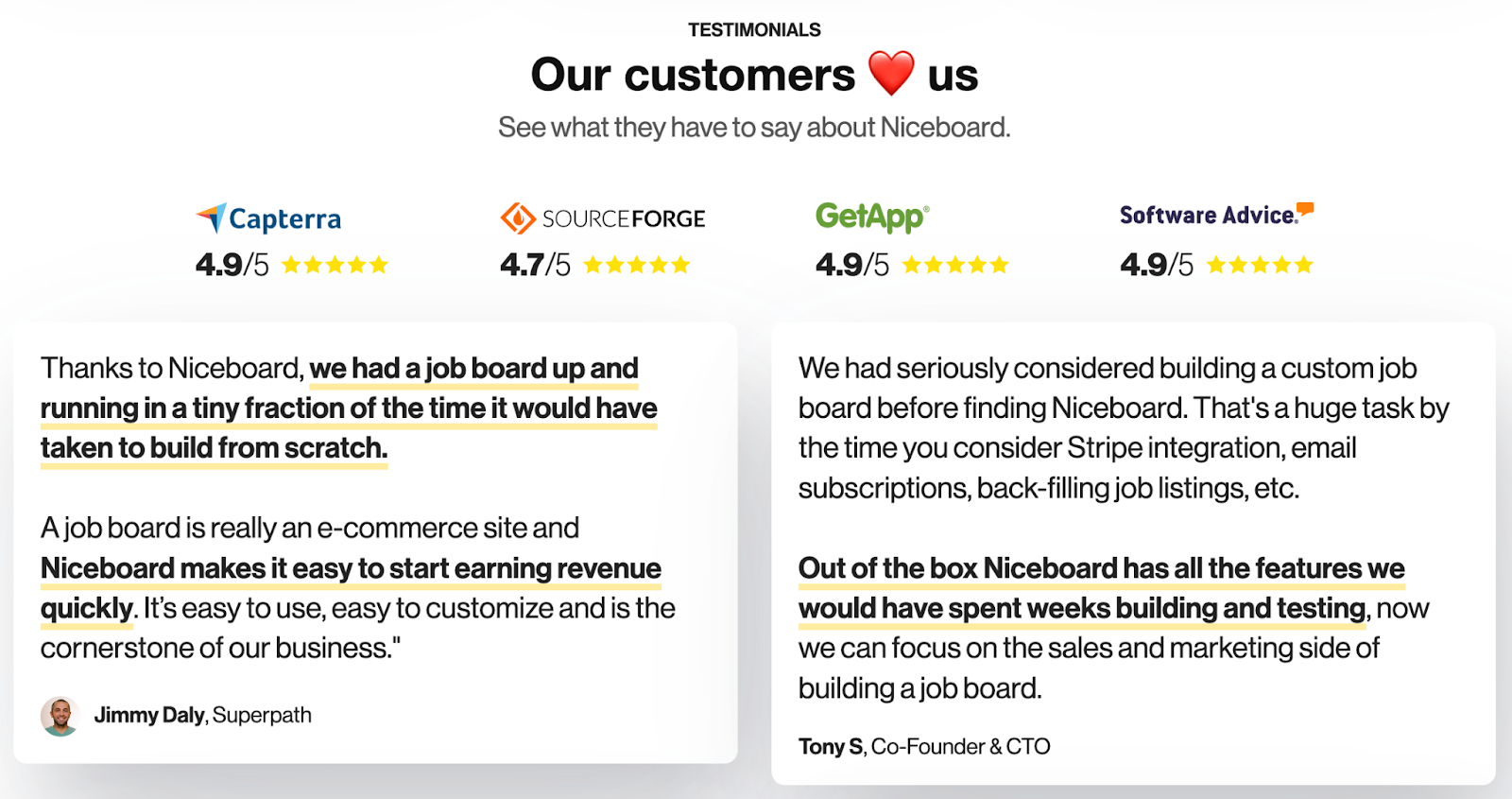
6. Leverage the Power of Social Proof
Social proof is the idea that people will follow the actions of the masses. It’s a powerful psychological concept that can significantly boost your landing page conversion rates.
There are many ways to use social proof on your landing pages. For example, you could include customer testimonials, reviews, ratings, Live Hashtag Feed or case studies with the help of a virtual assistant. You could also display logos of well-known companies that use your product or service. Combining all those different types of social proof throughout your landing page will help send signals of trust to your customers. Just like this SaaS business, combining star ratings from third-party review sites and in-depth customer testimonials speaking to specific use case:
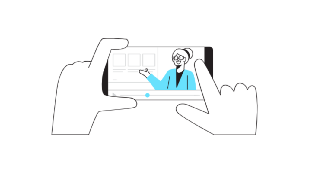
Furthermore, incorporating explainer videos into your landing page can provide vivid demonstrations of your product’s benefits, enhancing credibility and fostering trust. These videos offer engaging visual content that effectively communicates your brand’s value proposition to visitors.
The key is to show that other people have had a positive experience with your brand. This will help to build trust and credibility, and it can also help to reduce anxiety and increase the likelihood that your visitors will convert.
7. Use the Benjamin Franklin Effect to Your Advantage
The Benjamin Franklin Effect is a psychological phenomenon that says people are more likely to do a favor for someone if they’ve already done a favor for that person.
In the context of your landing page, you can use this effect to your advantage by asking visitors to do something small for you before you ask them to take the main conversion action.
For example, you could ask them to answer a simple question, like “What’s your biggest marketing challenge?” or “How did you hear about us?” before you ask them to sign up for your email list or book a demo.
By getting visitors to do something small for you first, you can increase the likelihood that they’ll take the main conversion action you want them to take.
Conclusion
There’s no need to be a psychology expert to use these principles to your advantage. With these seven simple psychology hacks, you can increase your landing page conversions and grow your business.
Related Posts
Paid Social Media Advertising: Your Guide
8 content mistakes that destroy SEO performance