
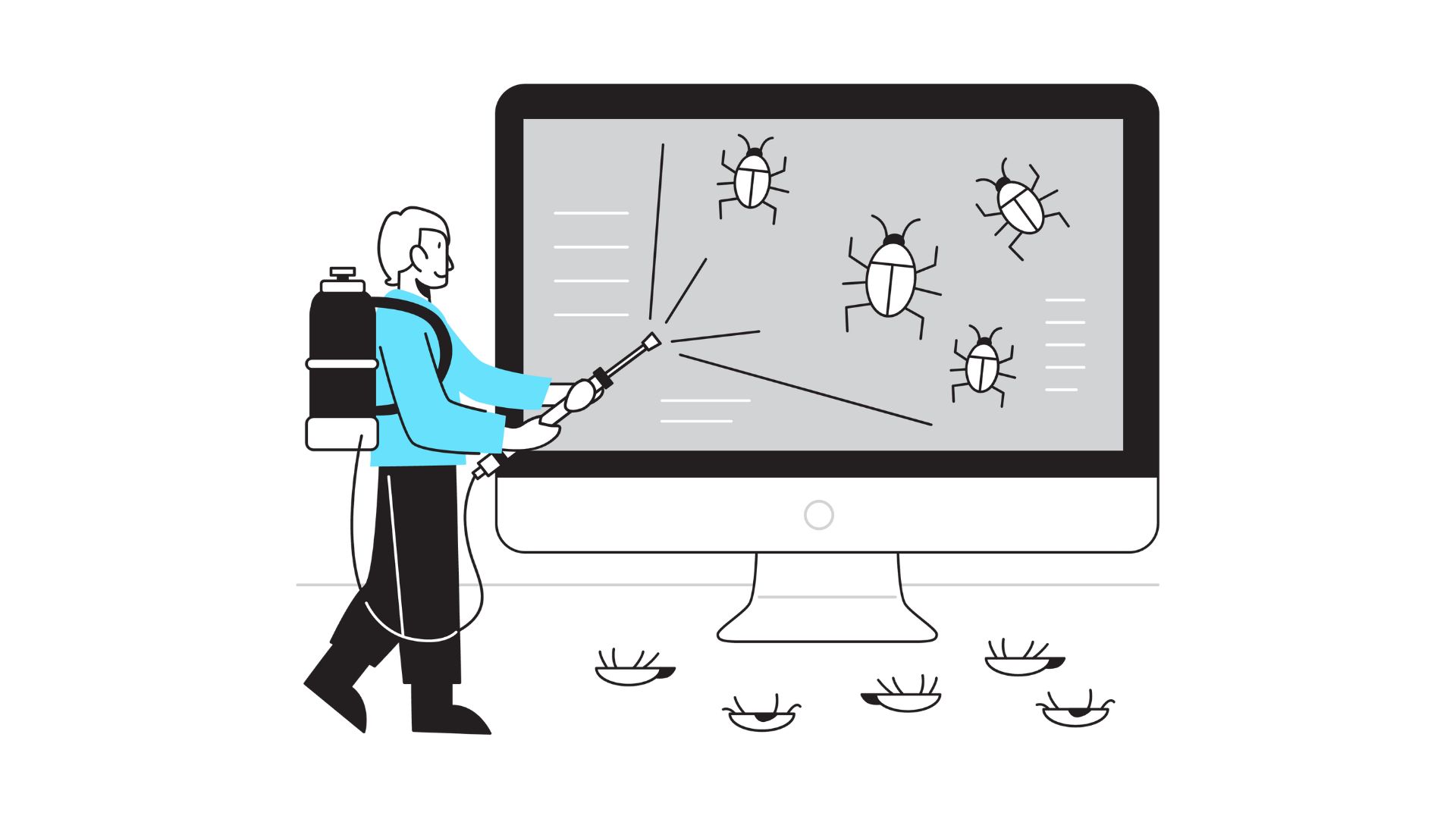
12 common bugs that ruin conversion rates
A conversion-killing bug isn’t always dramatic. Sometimes it’s invisible—an error message nobody understands, a form that works on Chrome but not Safari, or a button that sits quietly broken for weeks. All the best marketing in the world can’t overcome a digital tripwire between your user and their next step.
Ready to plug those leaks and stop leaving money on the table? Here’s what to look for—and how to fix it for good.
1. Broken buttons and dead links: the silent sales stoppers
You’ve invested in beautiful landing pages, crisp CTA buttons, and persuasive copy—but if “Add to cart” or “Get started” doesn’t work, nothing else matters. Broken links and unresponsive buttons are easy to miss, especially on deeper funnel pages that don’t get as much day-to-day traffic. Sometimes, a deployment wipes out a JavaScript dependency, or an old URL is retired, but a link lingers in your emails or navigation. One common example is outdated DNS records that point to inactive assets—regular monitoring using the SpamAssassin check and an SPF generator can help you spot and fix email-related issues that break user flows or trigger deliverability problems.
What it looks like:
- Clicking a button and nothing happens—no error, no feedback.
- Links to outdated content or, worse, “404 page not found.”
- CTAs that work on desktop but not on mobile, or vice versa.
Why it matters:
Users trust sites that “just work.” When a key button or link fails, people don’t write to complain—they simply leave. You lose sales and may never even know why, especially if analytics aren’t set up to catch these micro-errors.
How to fix it:
- Schedule monthly link audits with tools like Screaming Frog, Sitebulb, or Ahrefs.
- After every major content update or site deployment, manually test every major funnel: homepage > product page > checkout > thank you.
- Don’t rely solely on error reports. Make broken links a regular part of your QA checklist and incentivize your team to report any they find.
2. Slow page load times: killing conversions one second at a time
Page speed isn’t just about SEO—it’s make or break for conversions. Google’s own studies show every extra second of load time can slash conversions by up to 20%. Especially on mobile, users will hit the back button in frustration long before your hero image finishes fading in.
What it looks like:
- Pages take more than three seconds to load, especially on mobile data connections.
- Key conversion pages (pricing, signup, checkout) are bloated with heavy images, sliders, or third-party scripts.
- Cart abandonment spikes during high-traffic sales, or users drop out mid-flow.
Why it matters:
Patience is at an all-time low. Slow loads cost you trust and credibility, make your brand look outdated, and leave you vulnerable to faster competitors.
How to fix it:
- Compress and resize all images, and serve them in next-gen formats like WebP.
- Use a content delivery network (CDN) to speed up load times worldwide.
- Limit third-party scripts, tracking pixels, and heavy plugins—each one adds seconds.
- Use tools like Google PageSpeed Insights or GTmetrix to monitor and benchmark performance. Set page speed goals for every campaign.
3. Form field errors and validation fails: blocking good leads and customers
Forms are often the final hurdle in your funnel. But nothing stops conversions like confusing error messages, strict input requirements, or broken validation. Whether it’s a password field that hates your favorite symbol, or an address form that refuses to accept a real street name, these bugs drive users crazy—and drive them away.
What it looks like:
- Error messages that don’t specify what’s wrong (“Invalid input”) or appear only after the entire form is submitted.
- Phone or postal code fields that reject legitimate international formats.
- Users forced to re-enter all data after a single mistake.
Why it matters:
People won’t fight your form. One bad experience can ruin trust and push even high-intent leads to a competitor with smoother UX.
How to fix it:
- Use clear, inline validation—flag issues as users type, not after they hit “submit.”
- Allow for a wide range of real-world inputs (names with spaces or accents, different phone formats, etc.).
- Save user progress where possible, and make required fields obvious with asterisks or bold text.
- Test forms with users from different regions and devices—not just internally.
4. Mobile-unfriendly layouts: losing half your audience
It’s no secret: mobile traffic now outpaces desktop for most industries. But you’d be shocked how many “responsive” sites break key conversion flows on smartphones—tiny buttons, cut-off forms, sticky headers covering key content, or popups that won’t close.
What it looks like:
- Users must pinch-zoom or scroll sideways to see all content.
- Tap targets (buttons, links) are too small or too close together.
- Checkout, lead gen, or sign-up forms don’t fit the screen or lose functionality on mobile.
Why it matters:
A single frustrating mobile experience leads to instant abandonment—and negative word of mouth, since many users will never bother switching to desktop to complete the action.
How to fix it:
- Design for mobile first, not as an afterthought. Prioritize large tap areas, readable fonts, and vertical layouts.
- Test every step of your funnel on iOS and Android, across several devices and screen sizes. If you’re looking for expertise, consider partnering with the best UX design companies to enhance your mobile interface.
- Use browser dev tools to simulate mobile, but also do real-device checks—emulators can miss real-world quirks.
5. Misfiring popups and overlays: interruption instead of engagement
Popups, modals, and overlays can be powerful—when used sparingly and triggered thoughtfully. But a buggy, too-early, or impossible-to-close popup ruins the user experience instantly. Nothing’s worse than a GDPR banner or a newsletter offer that covers the “Buy Now” button on mobile and won’t go away.
What it looks like:
- Popups that appear too soon, before users see the offer or product.
- Overlays that don’t scale on mobile or block key navigation elements.
- No visible “X” or close option—forcing users to refresh or abandon the site.
Why it matters:
Users don’t hate popups—they hate bad popups. When overlays interrupt or trap users, bounce rates soar, and conversion rates plummet.
How to fix it:
- Set sensible triggers (e.g., after 30+ seconds or on exit intent, not instantly).
- Always include a clear, accessible close button in the top right corner (and make it big enough to tap on mobile).
- Limit the frequency: don’t show the same popup to users multiple times in one visit.
6. Cart and checkout bugs: the high-stakes conversion killers
Your checkout is where all the marketing effort pays off—or falls apart. Bugs at this stage are especially painful: coupon codes that don’t work, disappearing payment options, or forms that reset after a single error are all common but deadly.
What it looks like:
- Cart contents vanish when a user logs in or switches devices.
- The “Apply Discount” button triggers an error or does nothing.
- Payment fails for some methods, with unclear or no explanation, or page freezes after submission.
Why it matters:
Cart abandonment is already sky-high. Even a minor glitch can mean lost revenue, negative reviews, and a customer who never returns.
How to fix it:
- Test all checkout scenarios: guest vs. logged-in, different payment types, invalid coupons, etc.
- Log and review error rates from real users—don’t just rely on QA.
- Always provide a fallback: if payment fails, let users retry without re-entering all info.
7. Confusing error states or lack of feedback: leaving users in limbo
When users click a button and nothing happens—no spinner, no “processing,” no error message—they’re left wondering if the action worked or not. Some will refresh and accidentally duplicate their order; most will simply give up.
What it looks like:
- Buttons or links that give no feedback on click.
- Loading states that hang indefinitely or never resolve.
- Error messages that don’t explain what happened or how to fix it.
Why it matters:
People need to know what’s happening. Unclear or missing feedback makes your brand look unreliable and untrustworthy.
How to fix it:
- Show visible feedback for every action (loading indicators, confirmation messages, etc.).
- Use clear, friendly language for errors (“Oops! Something went wrong. Please try again or contact support.”).
- Review analytics for pages with high bounce or exit rates—these are often hiding feedback bugs.
8. Analytics and tracking code issues: flying blind (or worse, double-counting)
It’s not just about what users see—broken or duplicated tracking code can mean you’re missing vital data or misreading your true conversion rates. If a form submit fires two “success” events, or a key tracking pixel is broken, you’ll either overestimate or totally miss conversion signals.
What it looks like:
- Suddenly inflated or missing conversions in Google Analytics or your CRM.
- Retargeting or ad audiences that don’t update as expected.
- Tags that slow down page load or throw visible console errors.
Why it matters:
Bad data leads to bad decisions. Without accurate analytics, you’re guessing at what’s working—and may waste money scaling broken campaigns.
How to fix it:
- Use tag managers to keep tracking scripts organized and easily testable.
- Schedule monthly tag audits, and double-check tracking after every major site change.
- Set up conversion “goal” tracking and run test submissions regularly to make sure data is correct.
9. Inaccessible features or invisible CTAs: lost conversions for too many users
Accessibility isn’t just a legal checkbox; it’s a huge conversion lever. If your CTA button can’t be seen by people with colorblindness, or your signup form can’t be reached by keyboard, you’re losing real revenue (and risking compliance fines).
What it looks like:
- CTA buttons with low color contrast, or text that blends into background images.
- Forms that can’t be completed without a mouse, or that aren’t labeled for screen readers.
- Elements that appear fine on your monitor, but not for users with visual impairments or different devices.
Why it matters:
One in five users has a disability. If your site isn’t accessible, you’re excluding a huge part of your market—and sending a “we don’t care” signal.
How to fix it:
- Follow WCAG guidelines for color, contrast, and text size.
- Use semantic HTML, label all form elements, and test with real screen readers.
- Make sure every key conversion action is accessible by keyboard, not just mouse or touch.
10. Autofill and autocomplete failures: making users work harder than they need to
Today’s users expect forms to fill themselves—thanks to browser autofill, password managers, and smart devices. If your forms don’t play nice, users have to retype everything by hand, increasing frustration and dropout.
What it looks like:
- Fields that won’t accept saved credentials, address data, or credit card info from browsers.
- Overly strict validation that breaks when autofill tries to submit (“unexpected characters” errors).
- No prompts for mobile keyboards (like “@” for email fields or number pads for phone fields).
Why it matters:
Smooth autofill leads to higher conversions and less form abandonment. Making users do extra work loses sales.
How to fix it:
- Use standard HTML input attributes and proper field “name” tags for all forms.
- Test autofill across Chrome, Safari, Edge, and on both desktop and mobile.
- Guide users with input hints and choose the right keyboard for each field type (numeric, email, etc.).
11. Session timeouts and surprise logouts: trust-killers at the finish line
Nothing saps user confidence like getting logged out just as you’re about to complete a long form, check out, or download a resource. Sessions that time out too aggressively or without warning sabotage conversions, especially for B2B tools with multi-step onboarding.
What it looks like:
- Users forced to log in again after a period of “inactivity”—often just a few minutes.
- Entire carts or long forms wiped if the page reloads or the session expires.
- No warning that a timeout is about to occur.
Why it matters:
Lost progress leads to lost patience. Many users won’t bother starting over, especially if they feel the site “doesn’t care” about their time.
How to fix it:
- Set generous session durations for high-stakes pages (checkout, onboarding, etc.).
- Provide clear warnings before timing out (“Are you still there? Save your progress!”).
- Let users resume where they left off—auto-save data or store carts for logged-in users.
12. Unintended language or currency switches: global confusion, local abandonment
Global websites need to be local too. Auto-switching a user’s language or currency based on IP, browser, or even a cookie can disorient visitors and erode trust—especially if there’s no clear way to change it back.
What it looks like:
- Users land on your site and find everything in the wrong language or see prices in an unfamiliar currency.
- Changing settings is difficult, or the site “forgets” user preferences with every visit.
- Checkout shows different totals due to unexpected conversions or taxes.
Why it matters:
Confusion at the moment of purchase leads to last-second abandonment, more support tickets, and a brand that feels “not for me.”
How to fix it:
- Let users manually choose language and currency from any page, and remember their choice in cookies or their account.
- Detect location as a helpful prompt (“It looks like you’re in Germany. Switch to EUR?”), not a forced setting.
- Make sure totals and translations are clear, consistent, and visible through the whole journey.
Final thoughts: Sweat the small stuff—your revenue depends on it
Every tiny bug is a tiny leak—and enough leaks will sink even the most beautifully designed funnel. The best teams treat conversion as an ongoing audit: testing, fixing, and re-testing across browsers, devices, and user types.
Fixing these twelve bugs won’t just recover lost revenue—it will make your brand more trusted, your team less stressed, and your users far more likely to come back.
Bonus leak: missing referrals
If you’re not tapping into customer-driven growth, you’re leaving conversions on the table. Tools like ReferralCandy make it effortless to automate referral rewards, track referral links, and turn your happiest customers into a powerful acquisition channel.
Related Posts

How to become a flight nurse?

Best EMR for private practice: our picks